How did you use media technologies in the construction and research, planning and evaluation stages?
The biggest tool at my disposal during my research of short films was YouTube and its vast array of short films from independant production companies.
We watched some of these short films in order to gain an understanding of how short films are structured in order to cope with a limited space of time and how characters are developed in this time frame.
WordPress allowed me to create a blog that takes readers through the conceptualizationand development of my short film. The site provided me with layout and presentation tools which allowed me to create an interactive website rather than just a long piece of writing. The medium of a website gave me a better showcasing of my film concept, specifically with the way in which readers are able to explore it through different widgets and applications.
To shoot our film, we used a Canon 550D Which is a Digital SLR. This camera allowed us to get shot we would normally not be able to get with a standard digital camera and also allowed us to draw significance to these shots. Using a shallow focus us to signify a breaking moment for our protagonist. Using a close-up shot allowed us to focus on the emotion displayed on the protagonist’s face as he hears his wife tell him that she wants a child. His wife is in the background and is blurred however, you can still see her say the words. This technique allowed us to place a central focus on the protagonist’s feelings towards having children.
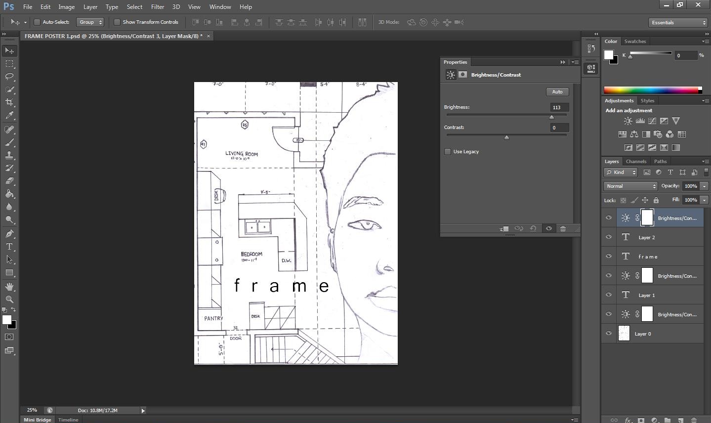
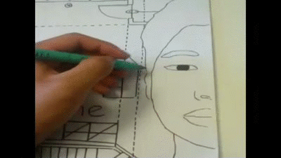
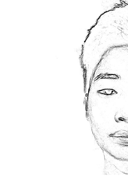
To create our film poster, we used Adobe Photoshop which allowed us to execute our idea of manipulating an image of a face into a hand-drawn sketch. We used the contrast settings on programme to darken the features on the subject’s face. This allowed us to print out an easily traceable image to physically trace and then scan back into the computer to re-enter the digital realm. This was then further edited using Photoshop in order to enhance the look of the poster.
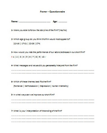
In order to conduct feedback for our film, we created a questionnaire for viewers to complete post-viewing of the film.
We made sure to select sujects from a range of backgrounds. Six of our candidates were female and the other six were male. They came from Dagenham, Mile End, Tottenham, and Kingston-Upon-Thames. All subjects were aged between 16-36.
All of the subjects selected ‘Yes’ when asked whether or not they could follow the storyline. This is crucial in gaining any understanding of the film so we were pleased to see that the story came across clearly.
Despite our film being based on a married couple, half of our subjects selected the young adult age bracket as the one which would find the film the most appealling. This showed us that the personal level of this film was felt strongly by our audience. Our audience mostly related to the themes and messages in the film rather than the characters themselves which was our desired intention for the film.
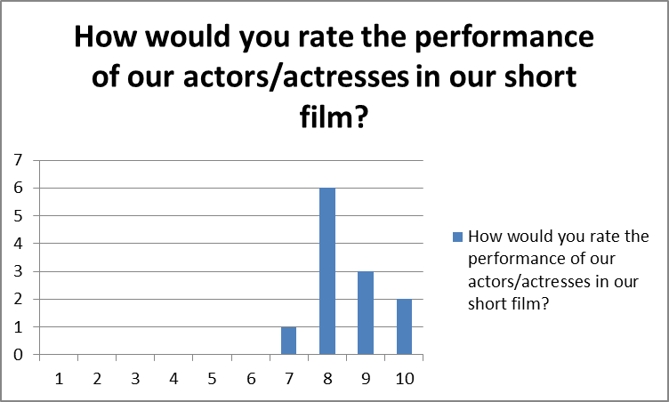
Using non-professional actors and actresses in the film meant that we ran the risk of lacking any naturalism in the performances displayed in the film. However, subjects mostly rated the performances given by the cast highly which tells us that the performances were believeable.
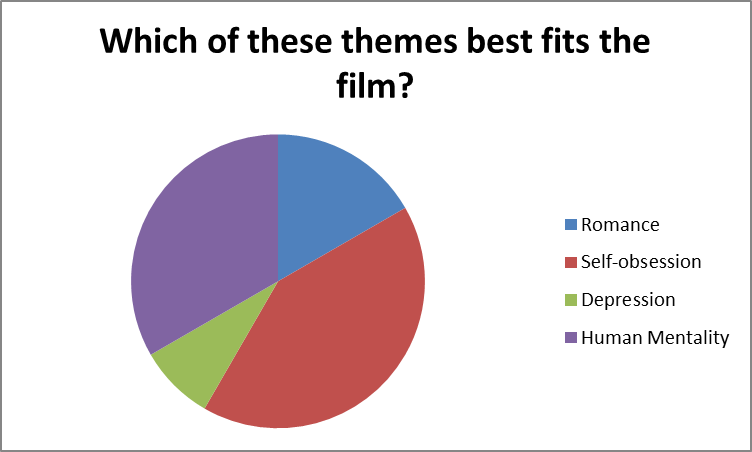
It was interesting to see that most of the people who filled out our questionnaire believed the main theme of the film to be self-obsession. We were glad to see that only a few people chose romance as we wanted our audience to read deeper into the film than something superficial like romance. The fact that most people either read the main theme of the film as human mentality and self-obsession told us that our psychological themes were clear in the story.
The questionnaire not only worked to collect quantative data, but also had open questions which asked about our audience members’ own personal interpretations of the film.
With regards to improvements on the film, we noticed some trends in the questionnaire. Subjects noted that they wished the pace of the film could have been a lot quicker at times than it was. Although we intended to have a slow pace throughout the film in order to draw on the emotive mood, we can see how audience members may sometimes find parts of the film a lot slower than it is recquired to understand the story and the emotions. A lot of the candidates wrote that they wanted more characters involved in the film. Although we disagree with this, we interpreted this response as our film lacking enough of a stronger connection between the characters and the audience.
Social Media
The response we recieved from our social media websites also provided us with a good insight into the way our film was percieved.
The commenting function on both Facebook and YouTube allowed us to gather the opinions of some of our viewers.
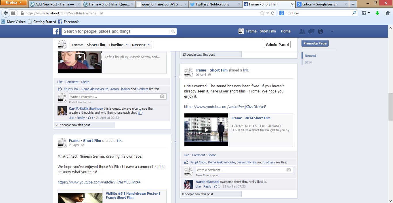
The response we recieved on Facebook was all positive. This is not only seen through the positive comments but also the growing number of likes on both the page and the film post. One fan even posted up her own short review of the film on her page. She outlined her personal interpretation of the ending and gave us positive feedback on some of our visual techniques such as the tea shot and final reflection sequence.
The comments we recieved on the YouTube video were both positive and constructive criticism. Once again, the tea shot recieved positive acclaim. Also, the performances delivered in the film were commended. One commentor noticed our cut-off in sound and said that the technique struck him. One commentor told us that the shots at the start of the film where we see the details of the character’s clothing should have stayed a little longer as he said it was “a little quick for the eyes”.
Another fan contacted me directly through Facebook’s inbox service to tell me what he thought of the film. He commended a line in the voice-over sequence.
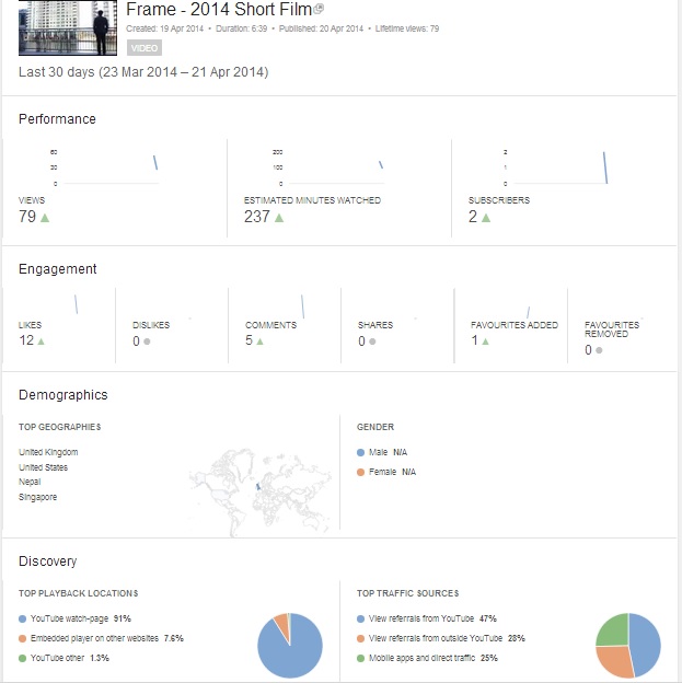
Looking at our YouTube statistics allowed us to see how are video was being recieved by the public. Statistics show that 28% of views are from outside of YouTube such as our social media websites. 47% are however from YouTube which indicates that people are directly making an effort to watch the video.
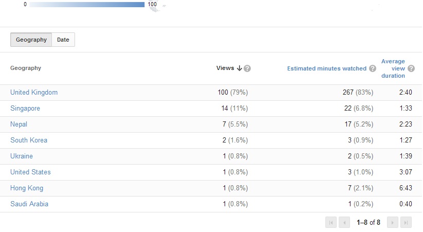
The geographic statistics of the video show us that not only has there been a good response in the United Kingdom, but our video has spread on an international level. We have had viewers from part of South Asia, East Asia, The Middle East, and The United States of America.
Audience Feedback Video
We asked some viewers their thoughts on the film and asked them to rate it out of ten.
We asked the subjects three questions:
1) What did you think about the short film?
This question was asked in order to get a general response from the subjects who had just seen the film. Most of the subjects found the film interesting to watch because of its unique nature. Some said they were able to relate to it and learn from it. This shows that our desired sentimental effect was achieved particularly when one subject commented on it being “touching”. One of the subjects did note that it was lacking in action and it was not gripping enough for him.
2) What was your favourite scene/aspect of the short film?
We wanted to get a more personally specific view from the subjects. Most of the subjects spoke about particular scenes and how they interpreted them as viewers. The final scene was commended by three of the subjects who spoke about the change they noticed in the protagonist. We also recieved answers which commended the themes and messages in the film. On subject said he was able to consider relationships in his own life more seriously. Another subject appreciated the idea of an OCD protagonist and was able to relate to this kind of mindset.
3) What would you rate the short film out of 10?
We asked this question to summarise the subjects’ overall view on the film. Subjects rated the film – 6.5, 7, 8, 8.5, and 9.
Through conducting audience feedback, we were able to learn what we did well in the creation of our film and what we could have changed to improve the final result. What has been most commended is the thinking behind the conceptualization of the protagonist and the themes which surround him. Audiences enjoyes the fact that they were able to connect with the messages of methodology and focused more on the film’s psychological aspects rather than the characters themselves. This was our desired result as we wanted to use a short space of time to make the audience think deeper than a story on screen. With regards to improvement, we did notice that a lot of people felt that the film was paced very slowly and althought that was our intention, they found it to be quite flat at times. If I were to remake this film in the future, I would only focus on long takes during scenes where there is responsive action. Overall, the film was recieved really well.
How effective is the combination of your main product and ancillary texts?
How successful is the poster in creating a brand identity for your film?
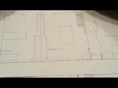
My film poster works very exclusively to create a brand identity for Frame through the technique where it appears to be a hand-drawn product. This allows us to reinforce the continuous theme of architecture in our short film.
We used an image of the protagonist’s face and created our own image of interior design blueprints and merged them into one piece. This technique enabled us to suggect the idea that the character’s life is no different from a bluprint – he had become the product of his own mindset.
Using only half of the subject’s face allowed us to create the impression that this is not his complete identity, but rather the side of him which has proved dominating. The facial expression made by the subject is very neutral which gives audiences the idea that he is an introverted character who wished not to express too much of himself. This allows us to shock the audience when they see him during the climax of the film where he is involved in an argument with his wife – it is made more emotive because this is a character who tends to hold everything in.
Taking advantage of a design student in our production team, we decided that the best way to merge this image with a blueprint would be to hand-draw it. This created a better effect in regards to it appearling like an authentic piece of design work. The fact that the audience see a drawing allow them to understand the symbolism in the film and the role of architecture in not only the film’s story, but the protagonist’s life.
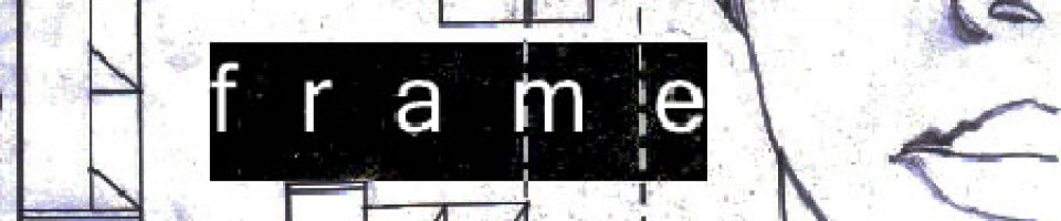
The title of our film is ofcourse prominent in the film poster. ‘Frame’ was chosen in order to give the feeling of entrapment or lack of liberation. Putting this into the context of real-world application, most audience member will associate a frame with a painting. As the title only focuses on the painting, the audience are left wondering the state in which the painting itself is in if only the frame is set into place.
We decided not to include a tagline on our film poster. This decision was made based on the fact that we wanted to entice our audience with the image rather than spark curiousity in them through words.This film is not straightforward and deals with complex issues, any tagline would either romanticise something which isn’t prominent in the film, or destroy the effect of our abstract image. We therefore decided against having a tagline
The design work on the poster was exteremely important as this itself was a theme in the short film.
The hand-drawn aspect of the poster was the key design element which allowed us to provide consumers with a film poster which they are not used to seeing. This is extremely symbolic of the messages and values provided through the film.
The credit strip at the bottom of the poster was not important for its design but rather an additon which allowed ourselves as independant filmmakers, showcase the film based on its art rather than our names. We are not popular names in the film industry and neither our any of the additional cast members. For this reason, we kept the copy at the bottom of the page and only clearly readable at a fairly close distance -for those who may be interested.
Using a film festival logo allowed us to give an accolade to the film which is an institutionalized incentive for the audience of the poster to watch the film. It has been validated for them through this logo.
How does the content of your magazine feature enhance the audience’s understanding of the film?
We wanted to use images on the article which were both from the film and also not from the film.
Based on the foundation we created for the layout of our magazine, we saw that we had space for two images captured directly from the film. Deciding upon two frames to show audiences was crucial in implementing some understanding of our story.
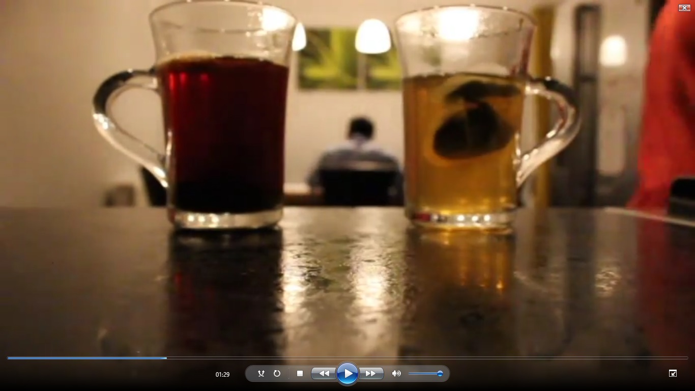
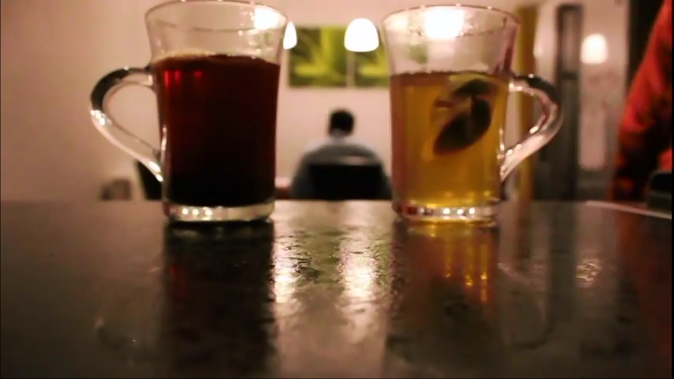
The first image we decided upon was a frame from the tea sequence which showed a strong black coffee on the left side of the protagonist and a green tea on the right side. This allowed us to show the audience two seperate sides of the character and the levels of beverage in each cup indicates that the protagonist is dominated by the coffee. He is the methodical, busy, city-life type man.
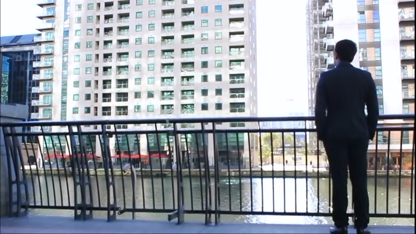
The second image we decided upon was the shot of the protagonist taken from the back as he overlooks some urban architecture beside the Thames. This displayed the importance of architecture in the life and mindset of the character.
The image we decided to use which was not a frame from the film was an image of all three of the creators of Frame – us. This image was planned to be placed in the beginning of the article where it information about our background as filmmakers is given. The shot was taken during the first shoot of the film which allows the image to be used in the article without dirupting the tone – the Canary Wharf background makes the shot feel reminiscent to the film itself.
We decided to base our magazine from British film magazine, Sight & Sound/ however, we wanted the language of the review to be less formal without being too immature. This will allow audiences from a range of backgrounds and ages to understand our film better unlike Sight & Sound which essentially mostly targets knowledgeable film buffs.
The review was approached at a favourable level however, we wanted to show that our review understood the film rather than just showing that it provided pleasure.
We chose to design our film in a similar layout to Sight & Sound in order to appear serious and appealing. This involved creating a simple foundation for our article with a plan white background.
I feel that both the poster and the article work well together to present the messages in the film and its intended tone. Through these texts, the audience our able to recognise and further understand the short film.
In what ways does your media product use, develop, or challenge forms and conventions of real media products?
Narrative
I took on the role as the writer of the film and executed Tsvetan Todorov’s narrative theory. Working in the medium of a short film meant that the narrative structure had to be manipulated so that we could tell the story efficiently in a much shorter space of time than a traditional Hollywood film which is what Todorov based his theory on. As a result, we essentially cut out the first stage – the initial equilibrium. The audience never see the protagonist in a happy relationship with his wife. The film starts at the heart of the disruption which was the issue of the protagonist having a clean cut lifestyle which does not merge well with his changing wife.
I also manipulated structure with the use of a flashback in the film. The flashback was something first executed by D.W. Griffith in his film Intolerance. Here it was used in order to show the audience the passing of generations up until the present time. In Frame, The audience initially sense a problem at the beginning of the film but a flashback is used to explain what happened prior to the current situation in order to widen the audience’s understanding and bring it into perspective on the film. This is used very frequently in the American sit-com, How I Met Your Mother with a ‘How did we get here?’ style of plotline as well as the Korean film, Peppermint Candy where the film is used to show the audience the events that have led up to the protagonist contemplating suicide in the opening of the film.
Camera
We used a range of camera techniques in the film all for different purposes in order to enhance certain scenes of our film. An overhead shot is used at one point in order to link the previous shot of a blue-print with the situation of the impending reveal that the protagonist’s wife wants to have a child – something she agreed not to ever wanting before marrying the protagonist. Not only does this overhead shot blur the line between the characters actual architectural blueprints and his personal life but also works to present the overshadowing of the protagonist’s character over the relationship. The zoom into the montage scene is reminiscent of Stanley Kubrick’s iconic maze shot in The Shining.
Editing
We feature a montage sequence in order to present an argument between the protagonist and his wife. This is a conventional way of showing the audience that a fight has taken place but without creating an entire scene covering it. With time being a overlooking factor in the medium of a short film, this technique was able to show the audience what they need to know in order to progress the story without taking too much time. This was inspired by an argument montage sequence that I watched in Wong Fu Productions’ Strangers, again.
The length of the takes grow increasingly longer up until the final scene where takes cuts are increasingly infrequent. This was done in order to slow down the pace of the film completely in order to represent a change in the characters mind-set. He ends up relaxed and lets himself go. Although our ending is ambiguous in regards to how he will follow through with the situation with his wife, it is clear that he is growing out of his controlled and always-efficient take on life.
Sound
A voice-over technique is used in the film over a monologue by the character who helps to spark a change in the protagonist. The audio from the conversation in the dining room scene continues as it cuts back to the protagonist’s journey through the architecture in the City of London. This highlights the on-going metaphor in the film of architecture representing the fixed plans of the character. The monologue picks up on this relation between the protagonist’s life as an architect and his life as a human being in love.
Mise-en-scene
The second scene of the film begins with a fixed camera position which frames our protagonist in the background and two different cups of hot beverages in the foreground – shot with a deep focus. The shot is intentionally composed like this in order to create symbolism in the story as a less direct way of introducing the dilemma faced by the character. The beverage on the right is green tea – an eastern drink representing clarity, health, and a clear sense of being. This is the side of a free-flowing nature that the protagonist could take where he stops structuring his life and lets everything run naturally. The beverage on the right is a straight coffee. Coffee represents a fast-paced city life and constant business. This is the current persona of our protagonist – someone always aware and in control.