Film Poster Research

A film poster is used by companies in order to advertise a film and draw interest from their target audience. The poster will usually give an indication of the genre of the film and what it could entail. One of the main purposes of mainstream film posters is the showcasing of the cast, director, or even film producer however independant films will not usually have have famous cast members or well-known directors and must therefore market the film purely through its art.


Film Poster Locations

Mainstream film posters can usually be found everywhere during the time of the film’s release.

– Bus Stops

– Buses

– Billboards

– Internet ad-space

– Magazines

– Newspapers

Independant films on the other hand are less-likely to be found in commercial areas but rather in places specifically suited to the independant film market.

– Film Festivals

– Indie Cafes

– Film Schools


Film Poster Conventions

I have created a list of film poster conventions below and have italicized the conventions that apply to short films wheras the un-italicized conventions are usually only found on mainstream films posters.

– Image

– Title

– Cast Names

– Social Media Links

– One-line Reviews

– Reference to Director’s Previous Work

– Film Festival Awards

– Production Company Name

– Certificate


We wanted our film poster to focus on a subject’s face in order to present the audience with the emotive vibe of the film.

Her-movie-poster

The film poster for Her does not show much of an insight into what the film is about but rather focuses on the expression of a man’s face.


4acec798715d41982aa61afaec8e8e00

The film poster for Dorian Gray shows a disintegrating face which pays homage to the novel and will be relatable by the novel’s fans. Also, this gives the audience an idea of what the film is about.


49-n2

I really liked the way this poster is an abstract image of a face. The creators took an original image and manipulated it to create a piece which is rarely seen on film posters.

Film Poster Development

We  drew on our idea of creating an abstract image for our film poster. In order to do this, we used an existing image of the actor who plays the protagonist in our film.

1


In order to turn this image into a blank sketch, we used Photoshop to adjust the contrast and applied a pencil sketch effect.

3


We liked the idea of merging a design blueprint with the sketch in order to make the entire thing look like a designer’s sketching work. We found a blueprint online and used Photoshop to overlap the images.

2

5


Looking on the way our film poster was beginning to look so far, we wanted to approach our layer differntly and so decided to change the full face into half a face. By removing the overlapping aspect of the images, we were able to draw a deeper meaning in the character as a seperate entity to the design work.

untitled

To create a more hand-drawn touch on the poster, we decided to print it out and trace it. Also, with Nimesh’s experience in the field of design, he decided to create the blueprint part of the poster himself rather than use a digitally-generated blueprint. Nimesh added in sections of a family home and clearly labelled them in order to let this theme of the film come through.

Namzsketching


After the entire drawing was finished, we scanned it and uploaded it onto Photoshop.

frame-poster-1

The image ended up looking a lot lighter than expected so we adjusted the brightness and contrast in order to make the lines appear darker.

frame-poster-2


The more we played with the contrast of the image, the more visible the handprints on the page were. This is something we actually grew to appreciate and felt like it gave a more authentic feel.

frame-poster-5

We also added in a title using Firworks and edited the colouring of the highlight block in order for it to marry well with the rest of the image.


In order to keep the poster as focused on the image itself as possible, we decided to only include a film festival logo and movie credits rather than covering any more of the image than necessary. This was all carrid out on Photoshop

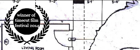
We used the shape of exisiting film festival logosand added our own text into it with all lower-case letters in order to remain consistent with the title.

frameposter

In order to make the credits clearly visible, we added a faded affect to the bottom of the page which added to our authentic look of the image. We only used film credits that were completely necessary, as we were not showasing the film based on popular people. We emmulated existing movie poster by packing the letters together.

frameposter


Before we began rendering the poster, we discovered a way to clean up some of the smudging effects with the brightness and contrasting tools while still retaining a good level of wear-and-tear style. We decided to put out poster through this process in order for it to look slightly cleaner and more pleasing to the eye.

IMG_20042014_231850


Final Product

frameposter