How effective is the combination of your main product and ancillary texts?
How successful is the poster in creating a brand identity for your film?
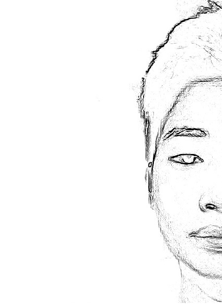
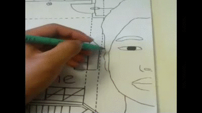
My film poster works very exclusively to create a brand identity for Frame through the technique where it appears to be a hand-drawn product. This allows us to reinforce the continuous theme of architecture in our short film.
We used an image of the protagonist’s face and created our own image of interior design blueprints and merged them into one piece. This technique enabled us to suggect the idea that the character’s life is no different from a bluprint – he had become the product of his own mindset.
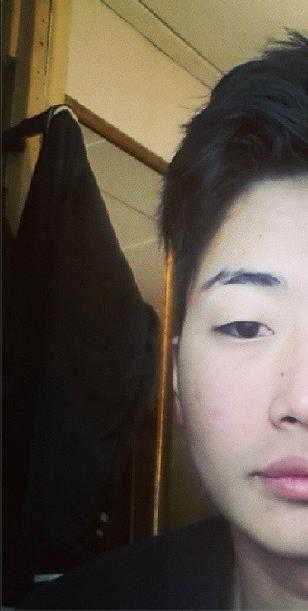
Using only half of the subject’s face allowed us to create the impression that this is not his complete identity, but rather the side of him which has proved dominating. The facial expression made by the subject is very neutral which gives audiences the idea that he is an introverted character who wished not to express too much of himself. This allows us to shock the audience when they see him during the climax of the film where he is involved in an argument with his wife – it is made more emotive because this is a character who tends to hold everything in.
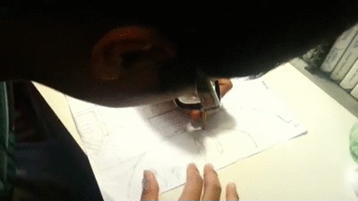
Taking advantage of a design student in our production team, we decided that the best way to merge this image with a blueprint would be to hand-draw it. This created a better effect in regards to it appearling like an authentic piece of design work. The fact that the audience see a drawing allow them to understand the symbolism in the film and the role of architecture in not only the film’s story, but the protagonist’s life.
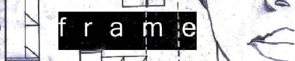
The title of our film is ofcourse prominent in the film poster. ‘Frame’ was chosen in order to give the feeling of entrapment or lack of liberation. Putting this into the context of real-world application, most audience member will associate a frame with a painting. As the title only focuses on the painting, the audience are left wondering the state in which the painting itself is in if only the frame is set into place.
We decided not to include a tagline on our film poster. This decision was made based on the fact that we wanted to entice our audience with the image rather than spark curiousity in them through words.This film is not straightforward and deals with complex issues, any tagline would either romanticise something which isn’t prominent in the film, or destroy the effect of our abstract image. We therefore decided against having a tagline
The design work on the poster was exteremely important as this itself was a theme in the short film.
The hand-drawn aspect of the poster was the key design element which allowed us to provide consumers with a film poster which they are not used to seeing. This is extremely symbolic of the messages and values provided through the film.
The credit strip at the bottom of the poster was not important for its design but rather an additon which allowed ourselves as independant filmmakers, showcase the film based on its art rather than our names. We are not popular names in the film industry and neither our any of the additional cast members. For this reason, we kept the copy at the bottom of the page and only clearly readable at a fairly close distance -for those who may be interested.
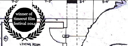
Using a film festival logo allowed us to give an accolade to the film which is an institutionalized incentive for the audience of the poster to watch the film. It has been validated for them through this logo.
How does the content of your magazine feature enhance the audience’s understanding of the film?
We wanted to use images on the article which were both from the film and also not from the film.
Based on the foundation we created for the layout of our magazine, we saw that we had space for two images captured directly from the film. Deciding upon two frames to show audiences was crucial in implementing some understanding of our story.
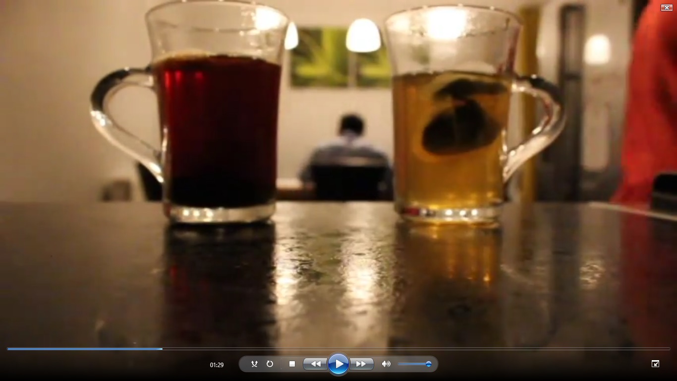
The first image we decided upon was a frame from the tea sequence which showed a strong black coffee on the left side of the protagonist and a green tea on the right side. This allowed us to show the audience two seperate sides of the character and the levels of beverage in each cup indicates that the protagonist is dominated by the coffee. He is the methodical, busy, city-life type man.
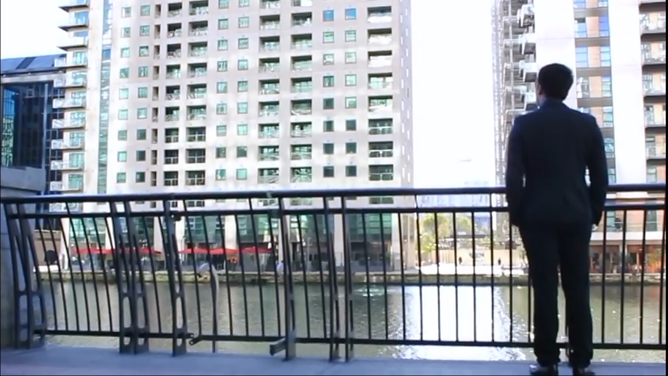
The second image we decided upon was the shot of the protagonist taken from the back as he overlooks some urban architecture beside the Thames. This displayed the importance of architecture in the life and mindset of the character.
The image we decided to use which was not a frame from the film was an image of all three of the creators of Frame – us. This image was planned to be placed in the beginning of the article where it information about our background as filmmakers is given. The shot was taken during the first shoot of the film which allows the image to be used in the article without dirupting the tone – the Canary Wharf background makes the shot feel reminiscent to the film itself.

We decided to base our magazine from British film magazine, Sight & Sound/ however, we wanted the language of the review to be less formal without being too immature. This will allow audiences from a range of backgrounds and ages to understand our film better unlike Sight & Sound which essentially mostly targets knowledgeable film buffs.

The review was approached at a favourable level however, we wanted to show that our review understood the film rather than just showing that it provided pleasure.
We chose to design our film in a similar layout to Sight & Sound in order to appear serious and appealing. This involved creating a simple foundation for our article with a plan white background.
I feel that both the poster and the article work well together to present the messages in the film and its intended tone. Through these texts, the audience our able to recognise and further understand the short film.
